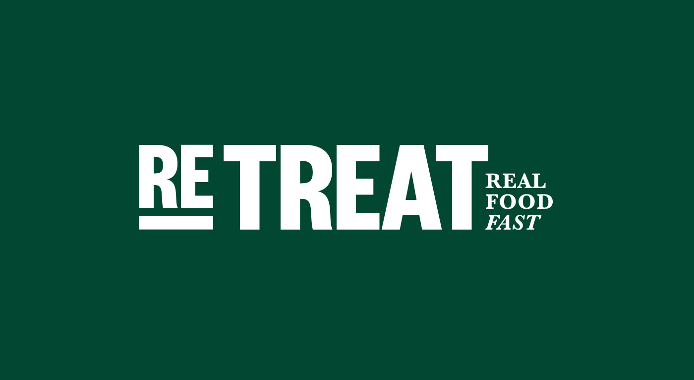
RETREAT
Naming and brand identity for a convenience food chain

Refuel
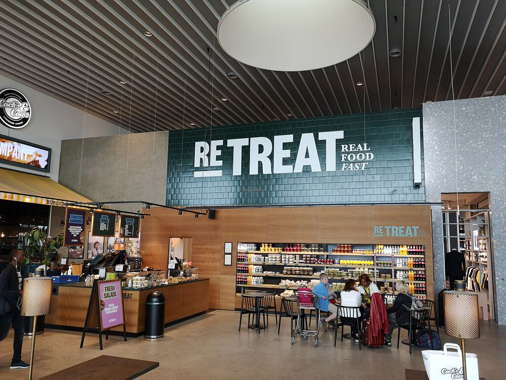
Retreat is a chain of 6 convenience food shops around Copenhagen. They aim to serve fast food without compromising on quality nor taste.
In working with the naming, Retreat was suggested. It’s a little retreat in a hectic day. A place to reload and to refuel, and a place that you revisit.
The wordmark “Re“ is used throughout the identity as prefix that can be added to a wide variety words, making it a completely dynamic identity component that is ever changeable.
The visual identity is built on the idea of the prefix, using repetition as a graphic idea. The dark green was chosen to represent something that’s healthy and doesn’t skip on quality.